


Monday, September 28, 2009
Thursday, September 24, 2009
10 easy steps to get the right colors when printing...
...or better be prepared to be surprised...that's a line in a song I'm listening to as I'm writing. It's from the soundtrack of "Dan in real life" - great movie.
Anyway, what I actually wanted to say is: be prepared to be surprised when you send your images to a printing service the first time. And I mean one that assumes that you are somewhat serious. One that does not use some kind of color correction, but assumes that you took care of color management yourself. I was pretty surprised when I did this for the first time and got almost completely black prints back. That was a couple of years ago. Since then I became very careful when it comes to printing.
Now behind it is a whole science which I'm not familiar with. I cannot even direct you to a good website explaining all this, because I simply didn't read into it. But I can still share with you some practical tips that I picked up. So far this has been working for me. If you have also ideas how to do this, feel free to leave a comment.
Here are some hints what you might wanna do in order to not throw your money out of the window, and instead get the same colors on paper that you see on your screen:
1. Ask your print shop for test prints of a kind of standard test image.
What you need is a test print that has been done on the same printer and paper your work is going to be printed with. A serious print shop has many different version of this one image and will recommend you to take those from them for free.
2. You also need this particular test image as a file.
3. The third thing you will need is an ICC profile for this printer. The ICC profile is a file that you can load into your image processing software. It will help to emulate the color behavior of the printer.
Now when you have all these three things, you can calibrate your screen. You have to do the following:
4. Open the test image with your image software.
5. In the color management of your software, switch to the ICC profile of the printer. The picture might now appear very different from before in terms of color, brightness, and constrast.
6. Next you hold the printed test image next to the screen.
7. You now adjust the screen settings until the print and the digital version on the screen appear equal, with matching colors, brightness, etc.
If you did this right, any pictures you load from now on into your software will look equal to how it would look when you would send it to the print shop. Most likely it won't look good anymore, so read on.
Now comes the annoying part:
8.With the altered screen settings and the profile loaded, you need now to adjust each image that you want to print until it looks the way you want.
So make a backup copy of it and start adjusting.
9. This altered image is the one you wanna send for printing. It's a terrible overhead, but definitely worth it if you are eager to get in print what you see on the screen. You can store your screen settings for the next time, so you don't need to go through everything again next time you want to print.
Why I'm writing all this right now? I just went through this as I'm preparing the Halloween exhibition. Not that I have any time for this right now, but it has to be done.
Because there are so many images that need to be printed (about 30) I don't want to risk that they are all off. So I added another step to the workflow:
10. If you have a large order of expensive prints, it might be a good idea to order only one print first and use this to double check/double calibrate the screen - see picture below. There was still a difference between the image on the screen and the printed one, so I was glad I did this extra step.

A picture of my desk while trying to match the screen with the print (step 10).
I hope this was useful for someone. Cheers!
Sunday, September 20, 2009

Thursday, September 17, 2009
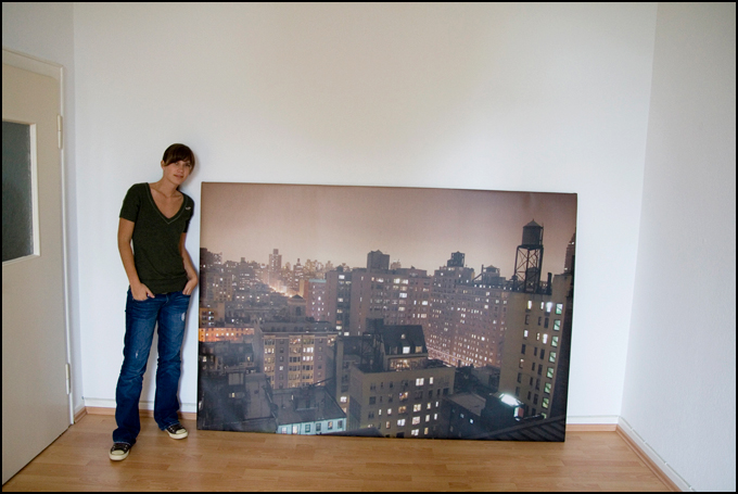
NYC Rooftops Print
That's another version of the Rooftop picture. The colors are a bit warmer, and that's what it looks like when printed very large. I haven't seen any of my pictures in such a size yet, but Mr. G.Ero, the brother of this young lady here (the lady happens to be the talented Miss Hoepner) made it happen. He is also the one who gave me access to this view.
Dear people, If you happen to have access to a spot with a decent view, please consider inviting me to take some pictures. It usually doesn't take longer than half an hour, and I will return the favor by sharing the full-resolution image files with you.
mail: oliver@fluck.de
Dear people, If you happen to have access to a spot with a decent view, please consider inviting me to take some pictures. It usually doesn't take longer than half an hour, and I will return the favor by sharing the full-resolution image files with you.
mail: oliver@fluck.de

Wednesday, September 16, 2009

Tuesday, September 15, 2009

Saturday, September 12, 2009

Wednesday, September 9, 2009
Seen.by goes US
I have the pleasure to show my work in another photo show that will open this month. Seen.by does its very first exhibition in the US, hosted by the OMC gallery in Huntington Beach, CA.
There is a press release on Facebook.
The list of featured artists goes like this:
Lena Beleke
Peter W. Czernich
Christine Ellger
Oliver Fluck
Matthias Just
Till Melchior
Thomas Schweizer
Harald Seiwert
At this point I could actually also tell you that I'm preparing a photo show in my hometown in Germany. It will be a series of cityscape prints mostly of size 80x60cm (32x24 inches) with 'plex'-finish.
Here are all three exhibitions ordered by opening date:
September 24: Seen.by US exhibition, OMC Gallery, Huntington Beach, CA (09/24 - 10/31)
October 7: "41 People in Costumes", Small World Coffee, Princeton, NJ (10/07 - 11/03)
October 29: "Amerikanische Stadtlandschaften", St. Vinzenz Krankenhaus, Limburg a.d. Lahn, Germany (10/29 - end of year)
Friday, September 4, 2009
Stories that start with image sensors suck!

What can you possibly tell when posting such an image? I wish there was a story to it that's of any interest.
Let's try this:
One day, I brought my image sensor up Empire State Building. He hasn't been there yet so I thought I would show him around. He was so delighted by the view, he said: "hold still! Hold still! I wanna collect those photons, they match so well together!" - and it turned out really pretty. When we came home from our trip my computer looked kind of jealous, sitting at home all day: "let me see what you guys got", said the computer quite angrily. My camera proudly handed out all those red, green and blue pixels it produced. The camera was startled to see the computer's defiant actions when turning all the beautiful colors into different shades of gray. When my screen saw the result, he first carefully looked at the two brawlers who had turned their backs to each other, then smiled at me, knowing this was the result I was looking for.
This one is funny:
American children stories end with: "And they all lived happily ever after."
You wanna know how the German version of this sentence goes?
It goes like this: "And if they didn't die, then they are still living today."
:-)
Tuesday, September 1, 2009
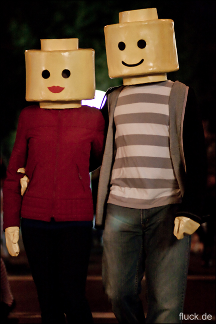
41 People in Costumes
So yeah, this is the title of my photo show. I already made the announcement on Facebook and Twitter, so I should also do it here. Starting from October 7th, the Small World Coffee cafe on Witherspoon street in Princeton will be decorated with a selection of images that I captured on Halloween in New York from 2006 to 2008. The whole text is now online on the Small World website. You can find it right here.
I really liked hanging out at Small World a lot and always enjoyed the artwork there - I'm glad to participate.
I really liked hanging out at Small World a lot and always enjoyed the artwork there - I'm glad to participate.

Subscribe to:
Posts (Atom)